
Get Your Free Brand Audit Questionnaire
Thank you! Your submission has been received!
Oops! Something went wrong while submitting the form.


It’s a common tension in nonprofit communications. The mission statement is clear and inspiring. The emails feel like a note from a friend. Genuine stories of impact shine across the site.
But scroll through the graphics, and something deflates. The photos feel generic. The colors have the energy of a tax-prep brochure. The content and the visuals seem to belong to two different organizations.
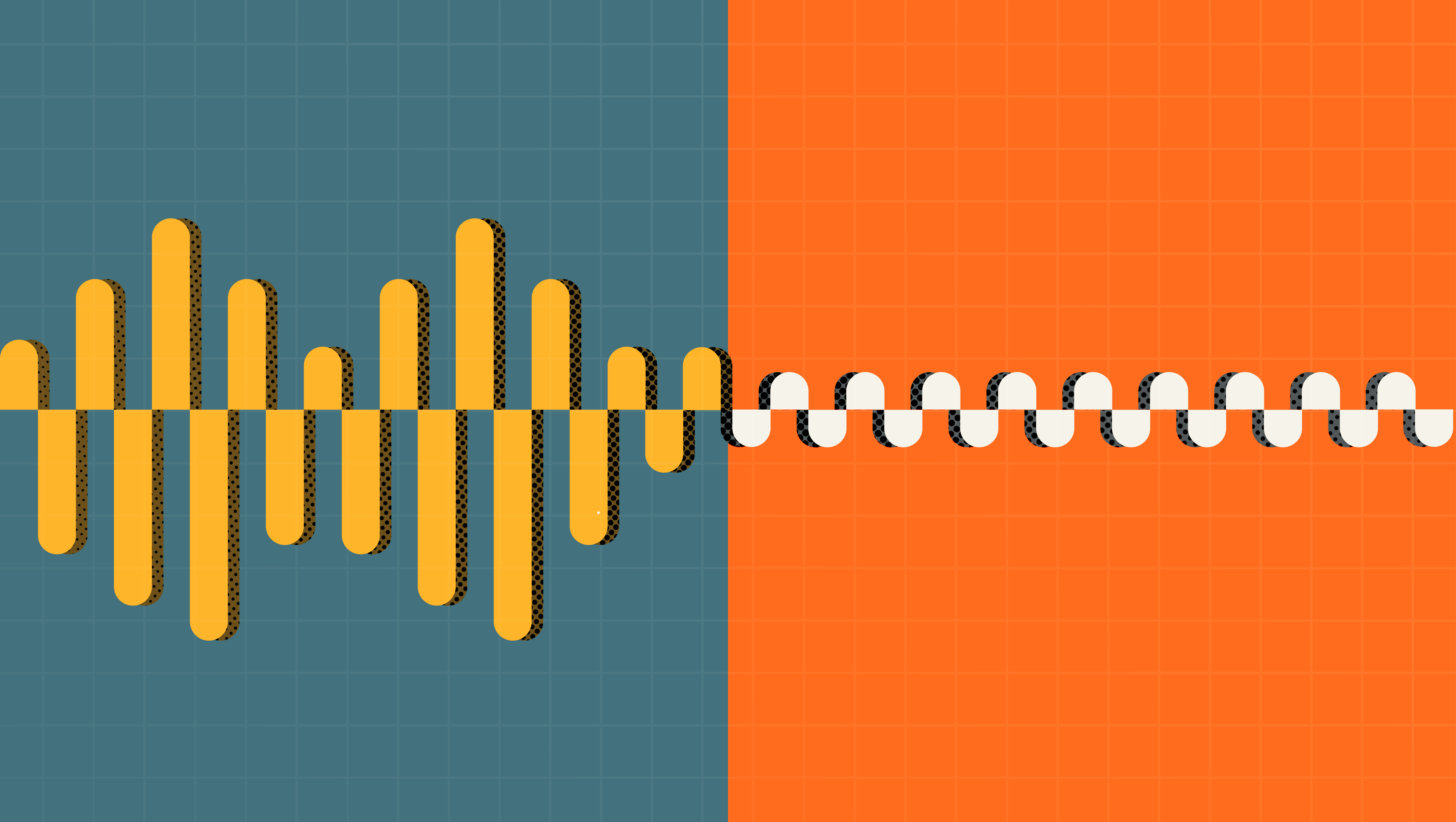
That little deflation is the sound of a brand at odds with itself, and it can undermine your hard work as a communicator. Audiences don’t read your copy, evaluate your designs, and then decide what they think. They take it all in together, usually in under five seconds.
When your words and graphics are telling different stories, your audience walks away with a vague feeling that something isn't quite right. In a crowded inbox, "isn't quite right" is enough to lose the click. Here’s how to tell if your voice and visuals are strangers, along with some simple steps to bring them in sync (hint: it doesn’t require a full rebrand).
Over the last decade of supporting comms for nonprofits, we’ve seen brand mismatches creep in through a few familiar paths. Sometimes, a logo and color palette developed early on go untouched longer than intended. Other times, nonprofits rely on different consultants for messaging, visuals, and web support, so the different parts of the brand never get a chance to connect to each other.
Recently, we’ve seen an uptick in “not-a-rebrand” asks among organizations interested in updating their strategic communications, but not their visuals. While keeping your messaging current is especially important in this environment, both to engage supporters and mitigate risk, you may be shortchanging your investment if you’re pairing your new comms strategy with a tired visual identity.
Brand alignment is the kind of work many organizations postpone because it isn't urgent, until suddenly it is. While it might not have the immediate ROI of a digital campaign, the results show up where it matters:
Open your website in one tab. Open your latest mission statement, case for support, or About Us page in another. Read the copy aloud, then look at the site.
Ask yourself: If this copy were a person, would they wear this website? Would they pick this typeface? Would they feel at home in this color palette?
If the answer is “no,” don’t stress. The information you need to align them already probably lives in your strategy and your team; you just need an efficient way to pull those ideas out of their minds and onto the page.
This is the point where it’s tempting to scrap everything and start fresh. At Statement, we almost never recommend that as a first step.
Defining your brand strategy — who you serve, your personality, the unique value you provide — helps ensure your voice and visuals talk effectively to each other and to your audience. While that might sound like a months-long endeavor, you can cover the basics in an afternoon with your team. To jump-start the discussion, check out our brand audit questionnaire.
Some key elements to consider:
From there, you can evaluate your content and designs to see what fits and what doesn’t. When we refresh brands, we consider the color palette, typography, photography choices, key messaging, and even headline and sentence rhythms through that lens. Sometimes, just one or two areas need tweaking; other times, both voice and visuals are strong but need a stronger throughline. Working from a well-defined strategy helps you direct your energy precisely, so the result is a cohesive and compelling brand.
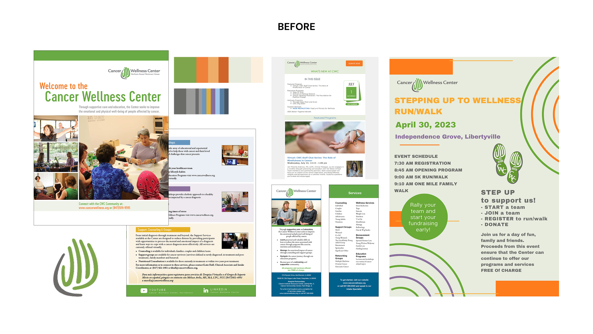
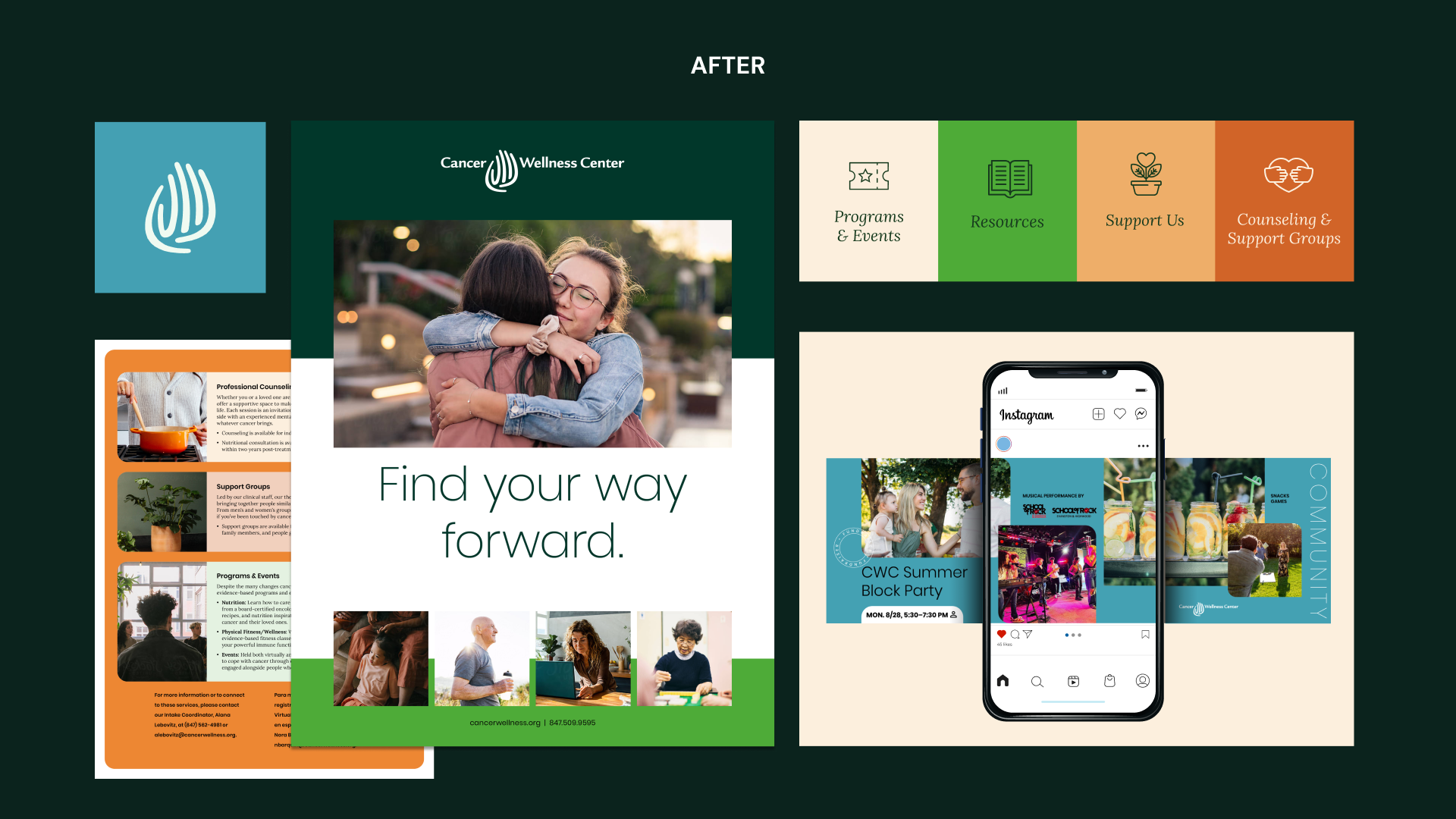
In our work with Cancer Wellness Center, our audit surfaced the insights needed to build a budget-aligned scope: sharpen the brand strategy, create a messaging toolkit, and give the design a tune-up. That clarity gave the whole community a tagline to rally around, Find Your Way Forward.
From there, we focused on marrying the visuals to the new messaging and fixing the text-heavy collateral that wasn't carrying the emotion and impact of the work. We streamlined the typography and color system and created more definition to the photography and graphic direction. Then we put it all to work in the tools the team uses every day: Constant Contact email templates and a full Canva brand kit, from the welcome guide to social graphics, so the new look wouldn't live in a guidelines PDF, but in the team's hands for easy brand management.
Brand alignment isn't a luxury for nonprofits with big budgets and long timelines. It's what makes everything else you're already doing work harder.
At Statement, we love helping nonprofits look as good as they sound, and sound as good as they look. Whether your voice has outpaced your visuals, your design has never quite matched your mission, or you're just not sure where the disconnect is, tell us about it. We'd love to hear your story and figure out the next step together.

Use our free audit questionnaire to jump-start the process with your team.
Get the questionnaire


